
15 Bathroom Color Combinations That Work Beautifully Together
TL;DR: The bathroom color combinations designers are backing for 2026 share one core trait: balance over contrast. Tonal pairings that sit close together on the color wheel, rust with clay pink, olive with moss green, plum with soft neutrals, create depth and warmth instead of the stark, clinical feel a bathroom can easily fall into. Even the boldest combinations, a chartreuse tile against blue-green wallpaper, work because one color is allowed to lead while the rest support it, rather than every element competing for attention at once.
Choosing a bathroom color scheme in 2026 has moved well beyond simply picking one wall color and a white vanity to match. Designers are increasingly treating bathrooms the way they’d treat a living room or bedroom, building considered, layered palettes rather than defaulting to safe neutrals out of fear the room will otherwise feel too cold or clinical. What separates a genuinely successful combination from one that feels chaotic almost always comes down to tone: colors that sit closely together create a cocooning, sophisticated effect, while colors chosen purely for contrast can tip into feeling stark if they’re not balanced carefully.
Here are 15 bathroom color combinations that hold together beautifully in practice, not just on a mood board.
1. Rust and Clay Pink for a Warm-on-Warm Cocoon
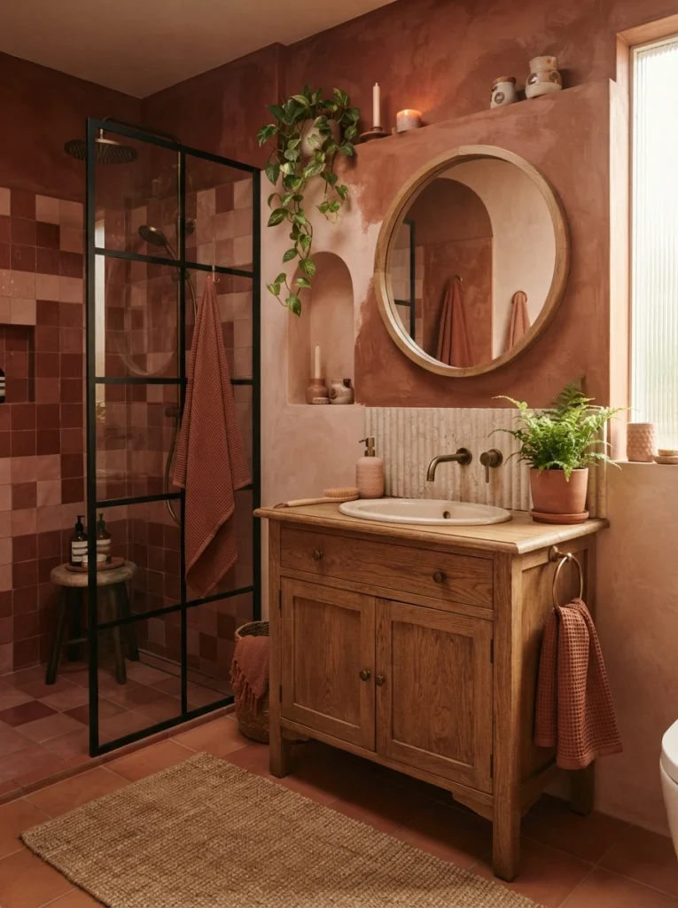
Combining deep rust tones with a softer clay pink creates a space that feels warm, enveloping, and genuinely atmospheric, since both colors sit close together in temperature rather than fighting for contrast. Designers favor this kind of tonal pairing specifically because bathrooms can otherwise feel clinical, and colors that wrap around the room in a similar warmth create a calm, cocooning effect instead.
2. Olive and Moss Green in a Tonal Layered Palette
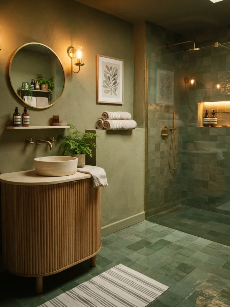
Layering a soft khaki olive on the walls with deeper moss-green floor tiles creates a tonal palette that feels both grounding and genuinely sophisticated, moving away from stark contrast toward something that reads as cocooning and connected to nature. This green-on-green approach is one of the clearest examples of the tonal-over-contrasting trend shaping bathroom color choices this year.
3. Plum or Burgundy With Softer Neutrals
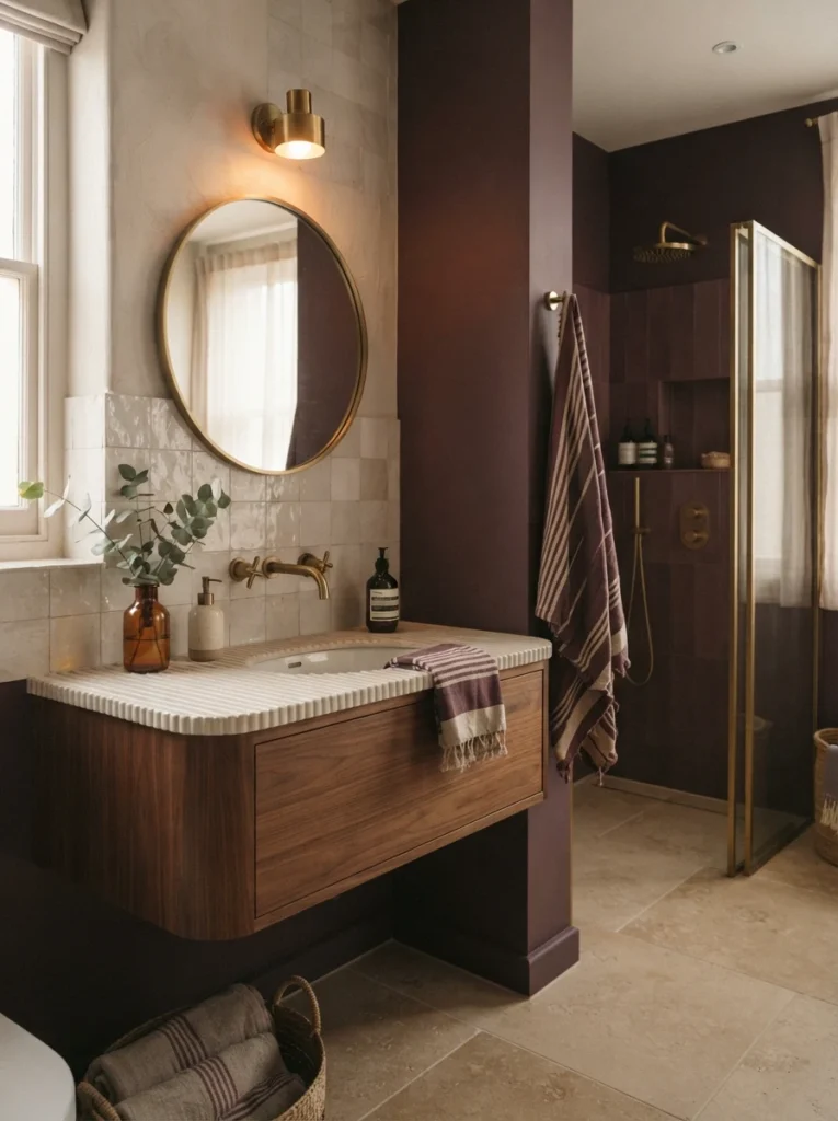
Richer, more saturated shades like plum and burgundy paired with softer neutrals create depth and warmth without tipping into the kind of stark contrast that can feel jarring in a small, frequently used room. This combination lets a bolder color take the lead while the neutral half of the pairing keeps the whole scheme grounded and livable.
4. Soft Gray as a Flexible Base for Any Accent Color
Soft gray remains one of the most enduringly popular bathroom colors precisely because it works well with almost any other color, letting decorative pieces and accessories stand out while the walls themselves stay neutral. Pairing it generously throughout the room, then adding a patterned shower curtain or a pop of color in the accessories, keeps the base flexible enough to update later without repainting.
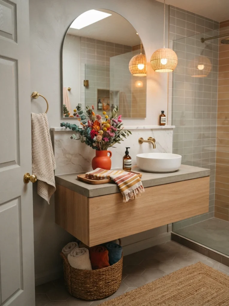
5. Blue-Green Patterned Wallpaper With a Chartreuse Tile Pop
A blue-green patterned wallpaper paired with matching trim and an unexpected pop of chartreuse on the tile creates a genuinely playful combination that still feels cohesive, since the trim ties the two bolder elements together rather than letting them clash. In-between colors like light turquoise and chartreuse are increasingly favored by designers specifically because they add personality without reading as jarring against a more classic palette.
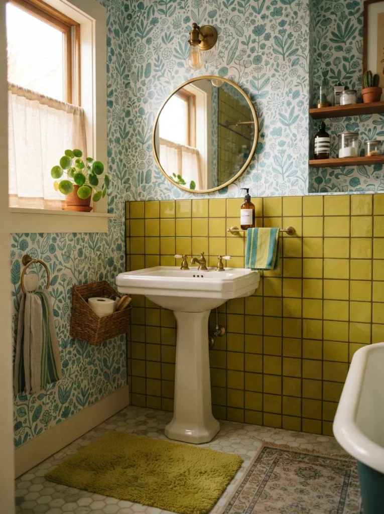
6. Terracotta and Sage Green for a Grounded, Nature-Inspired Look
Pairing natural stone or terracotta tile with earthy sage green creates a grounded, peaceful bathroom that works particularly well in homes aiming for a warm, nature-inspired ambience throughout. Both colors sit within the same earthy family, which keeps the combination feeling intentional rather than like two unrelated choices placed side by side.
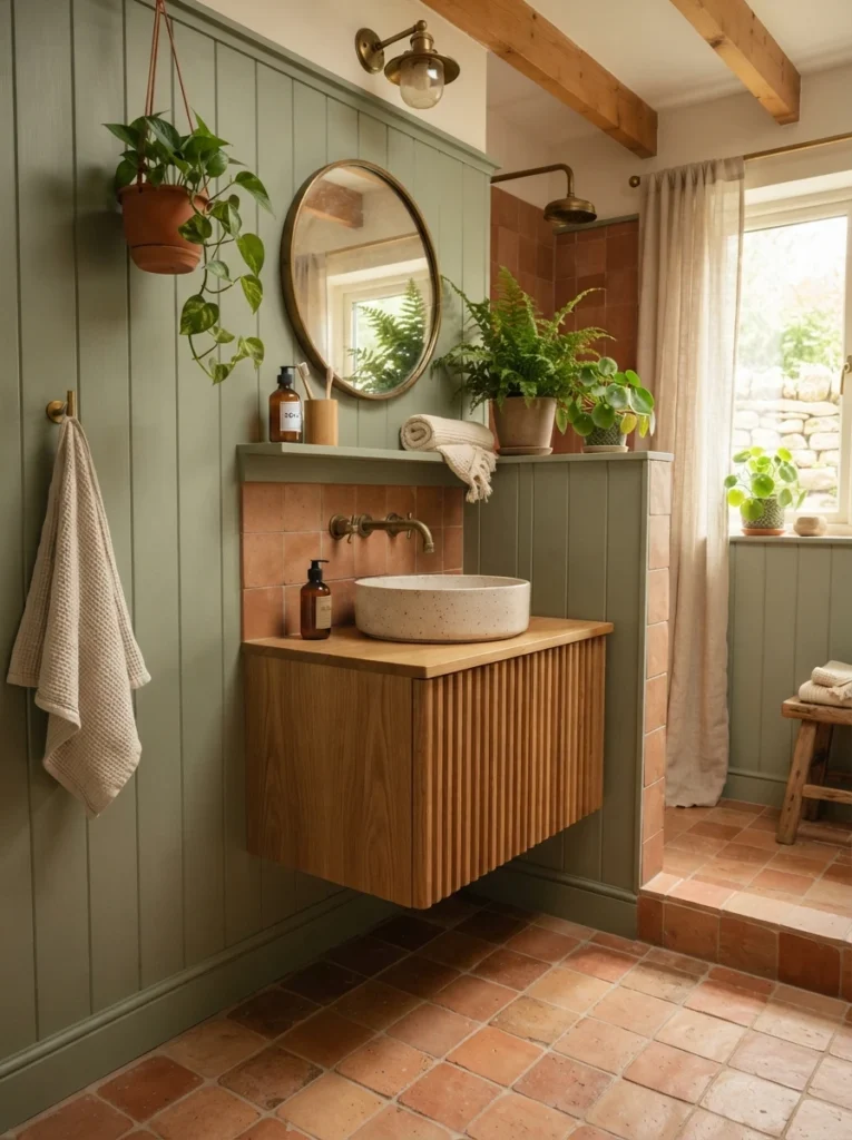
7. Deep Navy Paired With Warm Wood and Brass
Deep navy walls or cabinetry paired with warm wood tones and brass hardware balances a cooler, moodier color with enough warmth to keep the room from feeling cold or overly formal. This combination has remained a consistently reliable choice because navy reads as sophisticated in almost any lighting condition, while the wood and brass keep it approachable.
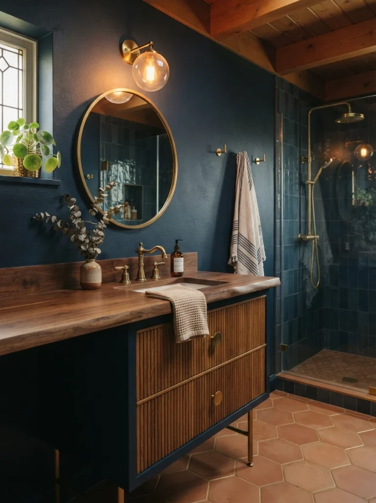
8. Pastel Blush, Powder Blue, or Lavender With Warm Wood
Updated, softer pastel tones, blush pink, powder blue, lavender, combine beautifully with warm wood, matte black accessories, and crisp white fixtures to create contrast without feeling overly sweet or dated. These pastels work especially well in a small bathroom, where their light, airy quality helps the space feel bigger rather than closed in.
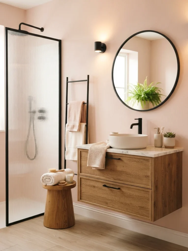
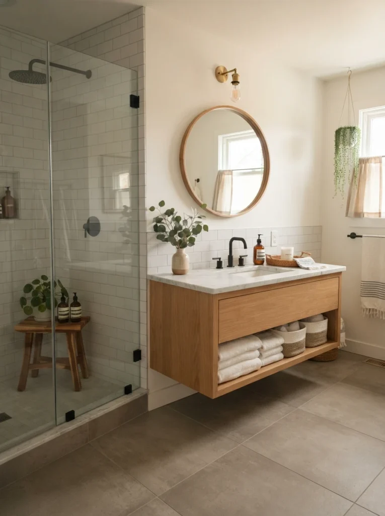
9. White and Gray as the Flexible American-Home Foundation
White and gray continue to serve as the foundation of bathroom color design across a wide range of architectural styles, from traditional houses to modern apartments, largely because they offer the flexibility to update fixtures and accessories later without redoing the entire room. Choosing softer, warmer versions of both, rather than stark bright white or very dark gray, keeps the combination feeling open rather than cold or heavy.
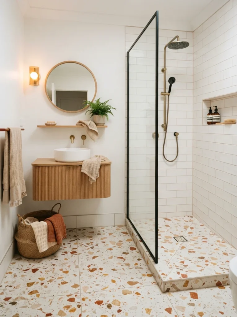
10. Terrazzo Applied Selectively Against White Walls
Rather than covering an entire bathroom in terrazzo, applying it selectively to the floor or the lower portion of the walls lets the material add real character without dominating the space, especially when paired with white walls and a simple, light-colored vanity. Warm lighting enhances terrazzo’s natural variation, making this combination particularly well suited to small or guest bathrooms where personality is welcome but simplicity still matters.
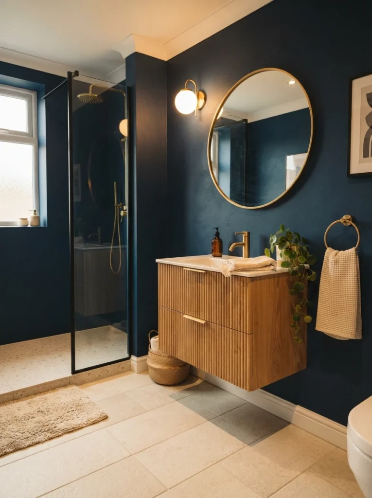
11. Deep Blue Walls With Lighter Floors for Bold Contrast
For a more energetic, statement-making combination, deep blue walls paired with lighter flooring bring genuine character and reflect a bold personal style rather than a purely safe, neutral approach. This pairing works because the contrast is clearly intentional rather than accidental, letting the deep blue read as confident instead of overwhelming.
12. Natural Stone With Earthy Brown or Terracotta Tile
Pairing natural stone tile with earthy shades like brown or terracotta creates a grounded, peaceful combination that suits a warm, nature-inspired bathroom particularly well. Choosing an anti-skid finish for wet areas within this combination keeps the natural, organic look intact without sacrificing safety underfoot.
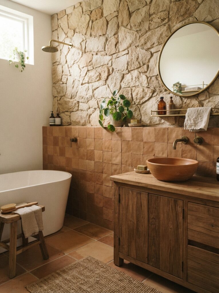
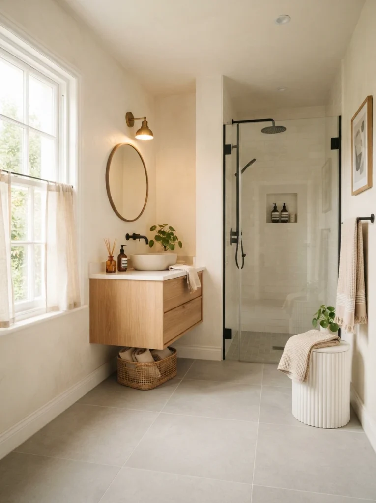
13. Warm White Walls With Light Gray Flooring for Open Contrast
Pairing warm white walls with light gray flooring creates a balanced combination that keeps the space feeling visually open while still offering a bit of contrast between surfaces. This approach avoids the coldness that can come from extremely bright white while also sidestepping the heaviness of very dark gray.
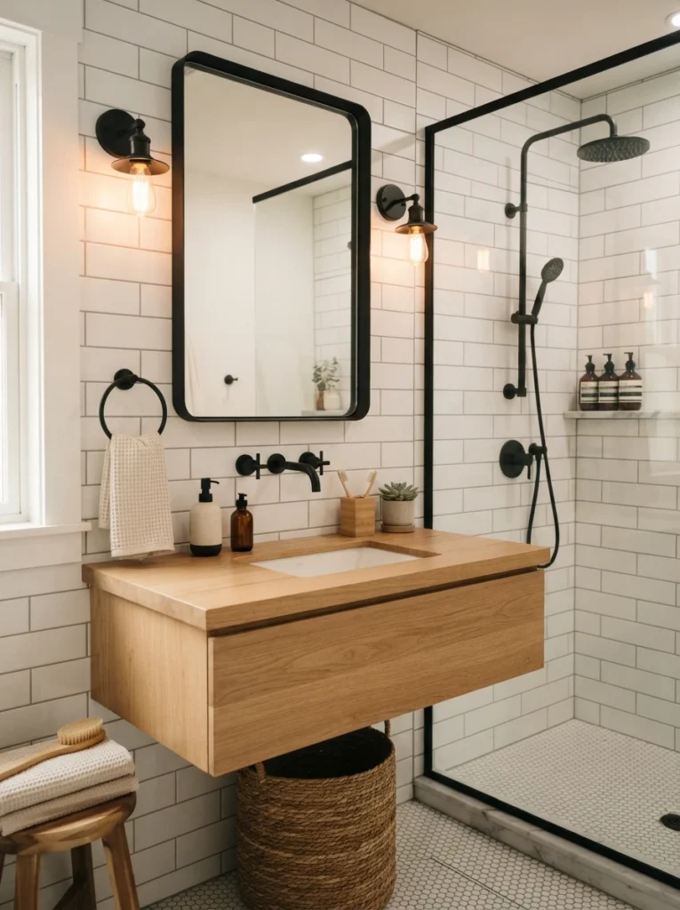
14. Crisp White Tile With Matte Black Fixtures
Crisp white tile paired with matte black fixtures creates a combination that feels effortlessly balanced and grounded, letting the black hardware provide just enough contrast without overwhelming the brightness of the white surfaces. It’s a dependable pairing precisely because it works across nearly every bathroom style, from modern to classic.
15. Tonal Combinations Over Stark Contrast for a Cohesive Feel
Across nearly every one of the pairings above, the common thread is choosing colors that sit close together in tone rather than colors chosen purely to contrast sharply with one another. This tonal approach is what most consistently creates the calm, cocooning, sophisticated feeling that current bathroom design is chasing, regardless of which specific colors end up in the mix.
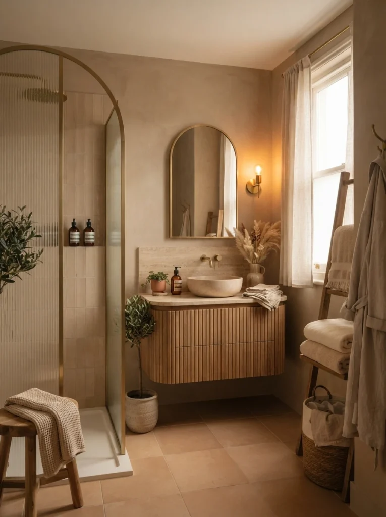
The most successful bathroom color combinations rarely come from picking two colors purely because they contrast well on a wheel. They come from choosing colors that share a similar warmth or sit closely together in tone, then letting one lead while the rest support it. Whether that means rust and clay pink, olive and moss, or simply warm white and light gray, the goal is the same: a bathroom that feels considered rather than accidental.